Can we talk about this Paciencia editorial for a second? Because I’ve been on the internet long enough to know the difference between a brand that shoots its products and a brand that understands how its products should be seen.
Most brands default to the catalogue approach: white background, perfect lighting, handles upright, every angle accounted for. It works. It shows you the bag. But it doesn’t say anything about it.
Paciencia doesn’t shoot like that.
The recent editorial, shot in collaboration with stylist Veekjames is the kind I keep returning to. What stands out first is what’s missing: performance. No one is posing for the bag. No one is “presenting” it. The women are just existing in their frames, and the bags are simply part of that reality. And somehow, that makes them more interesting.
The Estela in burgundy appears in one frame held loosely at the side, resting against the model’s hip. It looks unposed, almost accidental. The leather does the rest. Burgundy in good leather never sits flat. In many cases it catches light in a way that makes you want to reach for it.
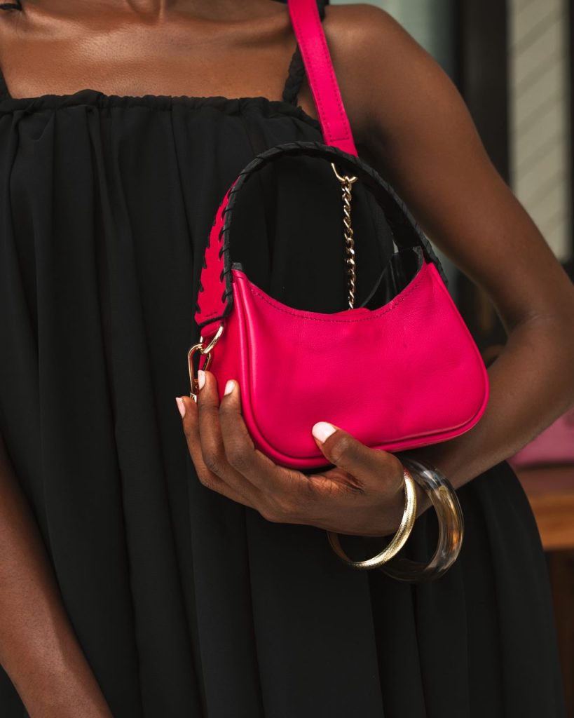
Another frame shows the Kyomi tote in sand pebbled leather. The model isn’t looking at the camera. One hand is raised mid-gesture, gold rings catching light, the bag held against her chest like something secondary to the moment. The branding sits quietly at the base, debossed into the leather rather than placed on top.
The image works because nothing is overworked. The bag isn’t competing for attention. It doesn’t need to. It just exists properly inside the scene. And that seems to be the point.
Across the recent editorials, the colour choices also say a lot. Ink blue croc, aubergine, olive, magenta, burnt orange. These aren’t neutral “safe” tones. They’re deliberate. They assume the audience already has taste.
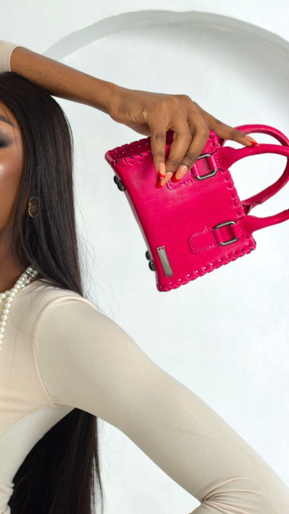
And because the leather is convincing, the colours hold. A good aubergine in real leather has depth, variation, and character, unlike fabric or synthetic materials, which tend to sit flatter and less nuanced.. The camera picks that up, but only because the shoot allows it to.
The Estela lineup image, three versions in burgundy, olive, and aubergine arranged side by side is probably the clearest expression of what Paciencia is doing right now. It isn’t just showing variation but consistency across variation. The design holds, no matter the skin it’s dressed in.
Paciencia understands what it has. And these editorials just show it.